Orphan and Widow in Typography Understanding Their Impact on DesignThe Importance of Typography in DesignTypography plays a crucial role in design, influencing both the readability and aesthetic appeal of any written content. While choosing the right font, size, and color are vital aspects of typography, there are also specific terms and concepts that help guide designers to ensure that their text appears clean, professional, and visually balanced. One such concept is the issue of "orphans" and "widows" in typography. These terms describe particular situations where lines of text are improperly spaced, leading to awkward or unsightly gaps in a block of text.
In this topic, we will explore what orphans and widows are, how they affect typography, and how to avoid them to create more polished, visually appealing text.
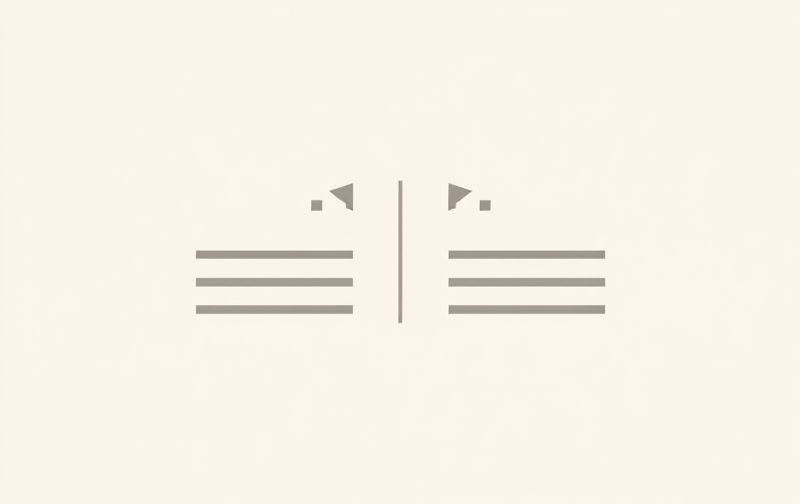
What Are Orphans and Widows in Typography?
In typography, both orphans and widows refer to short lines of text that appear on a page, typically as a result of improper text formatting or layout. These lines disrupt the natural flow of the text, making it harder to read and reducing the overall visual appeal. While these terms are often used interchangeably, they actually refer to two different issues
-
Widow A widow is a short line or single word that appears at the beginning of a column or page, isolated from the rest of the paragraph. It usually occurs at the top of a page or column, leaving one lonely line by itself, which creates an imbalance in the layout.
-
Orphan An orphan is the opposite of a widow. It is a single word or a very short line that appears at the end of a paragraph or column, separated from the rest of the text. Like a widow, an orphan creates an awkward visual break and disrupts the flow of the content.
Both orphans and widows are considered undesirable in typography, as they detract from the readability and professionalism of the text.
Why Orphans and Widows Matter
Orphans and widows can have a significant impact on the effectiveness of a design, particularly when it comes to printed materials like books, magazines, and brochures. Here’s why these typographic issues matter
-
Aesthetic Appeal Typography is an essential part of the overall visual design. Having orphaned or widowed lines disrupt the text flow creates an unattractive and uneven appearance. This can make the design look unpolished and unprofessional, which can affect how the reader perceives the material.
-
Readability One of the main goals of typography is to make the text easy to read and navigate. Widows and orphans break up the natural rhythm of the text, making it harder for the reader to follow along. This can lead to confusion and frustration, especially in longer blocks of text.
-
Consistency Good typography should have a consistent flow from one line to the next. Orphans and widows undermine this consistency, creating noticeable gaps that can distract from the content and interrupt the reading experience.
How to Identify Orphans and Widows
Identifying orphans and widows is a critical skill for any designer. Here’s how to spot these typography issues
-
Widow Identification A widow typically appears at the end of a paragraph, isolated on its own line at the top of a column or page. It often consists of one or two words that do not flow with the rest of the paragraph.
-
Orphan Identification An orphan usually appears at the beginning of a new paragraph or column, where the first line is left dangling without context. It can sometimes be just a single word or a very short line.
While these issues are easy to spot visually, they can be subtle and easy to overlook. This is why it’s essential to check the design carefully before finalizing it, especially if you’re working with long-form text or complex layouts.
Solutions to Fix Orphans and Widows
Luckily, there are several strategies that designers can use to eliminate or minimize the impact of orphans and widows in typography. Here are some practical solutions
-
Adjust Line Spacing (Leading) One of the easiest ways to prevent orphans and widows is by adjusting the line spacing, also known as leading. By increasing or decreasing the space between lines, you can often prevent a lone word or line from appearing at the top or bottom of a column or page.
-
Use Hyphenation Enabling hyphenation can help break words more evenly across lines, reducing the likelihood of widows and orphans. However, it’s important to be careful with hyphenation settings, as excessive hyphenation can make the text look cluttered and hard to read.
-
Manual Adjustments If you’re working with a specific block of text, manually adjusting the text can be the most effective way to eliminate these issues. You can move lines of text around, adjust paragraph breaks, or increase/decrease text size to ensure that lines aren’t left isolated.
-
Increased Column Width In some cases, orphans and widows may appear simply because the text is squeezed into too narrow of a column. Expanding the column width or increasing the overall page width can help create more balanced text blocks and eliminate these problems.
-
Track Changes in Font Size or Style Sometimes, adjusting the font size, style, or weight can help eliminate widows and orphans. For example, if you find that a particular font creates frequent orphaned lines, switching to a more condensed or spacious font might help.
-
Text Justification In some layouts, adjusting the text alignment can help distribute text more evenly, preventing awkward gaps. For instance, fully justifying the text can sometimes balance the length of lines, making widows and orphans less noticeable.
Best Practices for Avoiding Orphans and Widows in Typography
Here are a few general tips and best practices to ensure you create clean, well-formatted text
-
Regularly Proof Your Design Always review your design thoroughly before finalizing it. Use both automated tools and manual checks to identify any typographic issues, including orphans and widows.
-
Use Typography Software Many design programs, such as Adobe InDesign, have built-in features that automatically flag orphans and widows, making it easier to fix them quickly. Leveraging these tools can save you time and effort.
-
Use Generous Margins and Padding Sufficient margins and padding around text blocks help prevent crowded text, giving you more flexibility to avoid widows and orphans.
-
Avoid Justifying Small Blocks of Text While justifying text can look neat in large bodies of work, it can also exacerbate issues with orphans and widows, particularly in narrow columns. It’s best to use left-aligned text for smaller sections.
-
Opt for Larger Text Blocks When designing, avoid overly tight columns or cramped areas for text. Wider text blocks provide more room to adjust line breaks and reduce the likelihood of orphaned or widowed lines.
Conclusion Creating Balanced Typography
Orphans and widows in typography can make a design appear unfinished or unprofessional. Understanding the importance of these issues and how to fix them is a key skill for designers. By adjusting line spacing, utilizing hyphenation, and making manual text adjustments, you can ensure your text is not only readable but also visually balanced. These small yet significant details can elevate your design, providing a smoother, more pleasant reading experience for your audience.